*affiliate links included
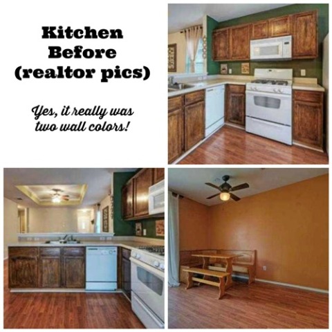
When we bought our "empty nest" home last August, we knew the kitchen makeover would be a big renovation job. I loved the eat-in kitchen layout, but that's where the love ended. The kitchen was painted a combination of hunter green and pumpkin orange. There was a ceiling fan in the corner of the room (because everyone wants dust blowing on their food). The cabinets had been "refinished" with a single coat of brown stain (by what I assume to be a three year old by the looks of them) and had never been sealed. The cabinet storage was minimal. The appliances were ancient, but working. The kitchen sink was a shallow six inches deep. I had huge plans for the renovation. Home Depot loves us.
The first thing I did after we moved into our new home was paint the kitchen a beautiful Clary Sage (Behr paint #PPU11-7). From my pencil sketch on a piece of notebook paper, my husband Johnny built a floor-to-ceiling, built-in, gorgeous, fabulous, wall pantry on the large empty wall. He is still working on the doors for the pantry, but that's a whole other blog post. (Sorry for the somewhat dark photos, but light from the outside forced me to close the curtains for pictures.)I stained the pantry (and sealed it) with General Finishes Java Gel Stain and General Finishes Polyacrylic Top Coat. They are the same products I used when I renovated the guest bathroom. It's a really dark brown, almost black, and looks incredibly clean and sharp. We left space in the corner for our big freezer.
My wonderful husband took down the ceiling fan and replaced the ceiling light with a little chandelier I picked out at Home Depot. I've always wanted an old-fashioned chandelier, but I didn't want to dwarf the kitchen with one. Although it's hard to tell in the photos (because of the backlight) the patio door curtains are a tan with dark brown stitching that looks like tree branches.
We also bought a round kitchen table and chairs since the eating area is now in the center of the room. We sold our big rectangular one when we moved out of the old house, so I saved the money from that for the new set.
Although the refrigerator and the microwave are the ones here when we moved in, the stove and dishwasher have been replaced since they both quit working shortly after we moved in. I spent an entire week refinishing the kitchen cabinets with the Java Gel Stain and Topcoat, and danced when my new cabinet hardware arrived in the mail. Watch for a post on how to refinish cabinets!
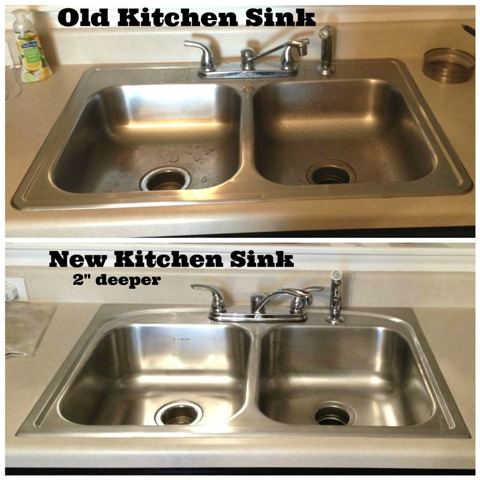
We installed under cabinet lighting on both sides of the microwave and you can see that post HERE. My incredible husband also replaced the kitchen sink for me. The new one is two inches deeper, because what gal doesn't want an extra two inches? We also selected a new faucet set for the new sink.
I absolutely LOVE the contrast between the dark cabinets and the white appliances. The countertop is an almond color laminate, which works just fine for me. I don't the busy look of granite anyway and even though these are the ones that came with the house, they are in great condition, except for a few little scratches. (The three pictures below were taken with the curtains open.)
The flooring is still the original flooring that is through most of the house. It's a laminate floor and is functional, but it was installed poorly and there are low spots in some places, as well as some spaces between some of the boards. The installers also didn't remove the baseboards. We hope to replace the laminate flooring in a year or two, with a lighter color wood.
You can see by my full pantry below, why we needed the extra cabinet storage space. Each vertical section will have a top pantry door and a bottom pantry door. We have family coming in July for our son's wedding and hopefully it will be finished by then.
I am thrilled beyond belief with my kitchen renovation! What do you think?
I put a new, lighter area rug under the dining table and chairs to brighten up the room too!
See my other home renovations here.
Share this post with the buttons below!


oh yes I LIKE it !!! I really like the color contrast with the super dark cabinets and the white appliances - really looks sharp! Your hubby is a definitely in the class of craftsman - his work is really good (now to find his "twin" in the East to come work on my kitchen)
ReplyDeleteThank you so much! Yes, he is very talented. I'm a lucky gal to have him in my life.
DeleteLisa, you have done a wonderful transformation to the whole house. Gorgeous.
ReplyDeleteThank you Lynda!
DeleteBeautiful!! I love how this turned out. It like the open design.
ReplyDeleteThank you very much!
DeleteLooks great, Lisa! I need you to come over and do ours!
ReplyDeleteThank you! I'm going to pass on doing yours. LOL. I'm tired.
Delete